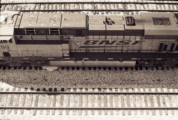
BNSF Locomotive
BNSF locomotive in downtown Atlanta. Also seen on the second picture, are the locomotive, a public transit train (MARTA), and a car on I-20.
Praktica BC1, Praktica MC Pentacon 50/1.8, Ilford HP5 Plus 400. Unedited.

Updated:
The following picture is the same than the first one, except that it was scanned at 8 Bits instead of 24 Bits. Using Plustek 8200i, I scanned the first picture with the 48->24 Bits color mode and the third one with the 16->8 Bits color mode. I normally tend to chose the first setting because I feel that the 8 Bits mode might be a way to force the scanner to only see a limited range of grey tones. Which of the two settings re-produces the real black and white emulsion from by the film? I’m still exploring this question.


Very nice B&W images. To get three modes of transportation in your second photo is extra nice.
Your first two appears as “fading” B&W, while the third one is like a “fresh” B&W … if that makes sense.
Thank you David. What you said makes sense. The combination of over-exposure; high contrast; and brown hues gives the first picture an old look. The difference with the third picture is that the first one was scanned in “Color mode”, using a 24 bit dynamic range, while the third one was scanned with the 8 bit “B&W mode”.
Fascinating comments on scanning, which as an old ‘wet print’ guy returning to film I find really problematical. I manage OK on colour film but find B&W a nightmare (an old Dimage multi-scan II for 35mm and a Epson 4990 for larger – both with VueScan).
Your comments inspired me to make another experiment. I opened the image scanned in Color Mode in Photoshop; applied the Image>Adjustments>Black&White correction with default settings; and the results were absolutely identical to what I got when I scanned the image in B&W Mode.
So both the scanner and Photoshop use the same parameters. But now, I am starting to thing that black and white digitization is not just obtained by limiting the dynamic range of colors but also through different degrees of saturation for different colors. Here’s what the default saturation values are in PS:
Red 40%; Yellow 60%; Greens 40%; Cyans 60%; Blues 20%; Magentas 80%.